
Summary:
Four principles of form design — structure, transparency, clarity, and support — minimize users’ cognitive load and improve usability.
Forms are mental work.
While we’ve previously explored how to minimize physical effort in forms through the EAS framework (Eliminate, Automate, Simplify), this article focuses on reducing the mental effort — the thinking, recalling, and decision making — that users face when filling forms, so they can complete forms with less cognitive effort and more confidence.
Reduce Cognitive Load: 4 Principles
Every field in a form demands that the user interpret the question, find the right information, and provide it in an acceptable format. All these add to the cognitive load — the mental effort required to get through the task. When this load gets too high, users are more likely to make mistakes, feel overwhelmed, or abandon the form altogether.
Follow these 4 principles to reduce cognitive load in forms:
- Structure: Organize content logically to create a clear path to completion.
- Transparency: Communicate requirements and set expectations upfront.
- Clarity: Make content and interaction easy to understand and leave no room for ambiguity.
- Support: Provide timely, helpful guidance throughout the process.
Structure
Human brains naturally look for patterns and relationships in information. When forms are structured logically, users can see the big picture, understand how different pieces fit together, and move through the form more efficiently.
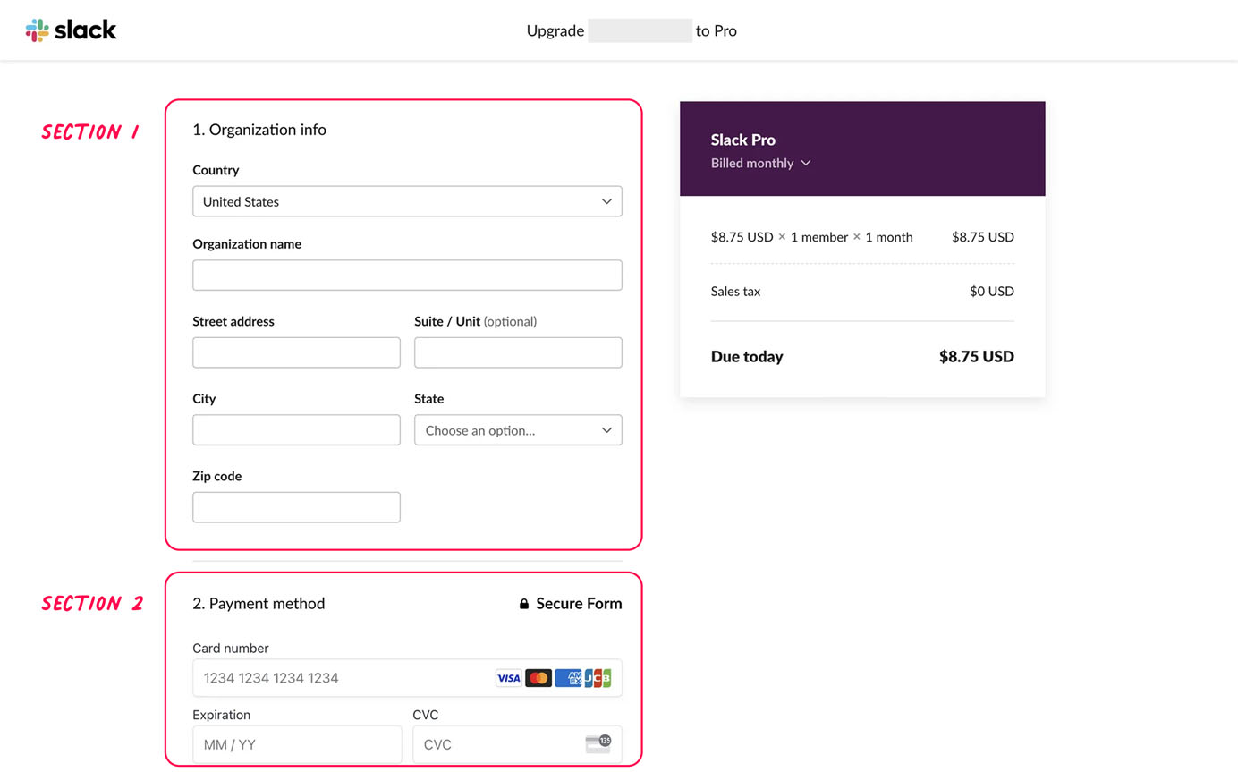
Group Related Fields
At the question level, certain types of information, such as the username followed by the password, or street addresses followed by the city, commonly appear together. Grouping related questions helps users retrieve information from memory more easily.
At the form level, grouping related fields into sections makes long forms feel more manageable because it:
- Allows users to focus on one information category at a time
- Minimizes context switching between unrelated topics
- Creates a sense of progress as users complete each section
In addition, adding clear, descriptive headings to each section provides users with a helpful preview of the upcoming topic. These signposts reduce cognitive load by establishing context before users encounter specific fields.
Create Visual Hierarchy
A clear visual hierarchy naturally guides users’ attention to the most important elements. When implemented effectively, this hierarchy clarifies relationships between form components and helps users understand the overall form structure at a glance.
Start by applying consistent, strategic spacing to form fields. Elements close together are perceived as related, so place connected fields closer while allowing more space between distinct sections.
If spacing doesn’t provide enough clarity on how elements are related, reinforce groupings with containers, subtle divider lines, or colored backgrounds. This is the Gestalt principle of common region in action: visual boundaries help users quickly see which parts of the form belong together.
Apply visual weight strategically to emphasize importance through size, color, contrast, and typography. For example, form labels often use a heavier font weight to stand out from secondary help text. Error messages commonly appear in red to draw attention, while optional tooltips are typically minimized or hidden by default to reduce distraction.
Sort Questions and Options in a Logical Order
Structuring a form is like having a conversation. The order of the form questions can impact flow and comprehension. Imagine sitting down with someone and asking them these questions face-to-face — what order would feel natural and respectful?
In real conversations, it is natural to adjust your followup question or response based on what the other person said. Forms with branching logic work the same way. This approach — often referred to as a “wizard” — dynamically displays relevant fields based on users’ prior input. Wizards not only minimize the physical effort required to fill out the form but also save users from spending attentional resources to scan and filter irrelevant questions.
The order of the questions should primarily minimize the effort necessary to fill in the form. This is a good principle to keep in mind, whether your form has branching or not.
For example, if you want to know what problems users experienced using a product, you would start by asking them whether they have encountered a problem instead of asking them to enter their name, because the name will not be relevant if the user has not encountered a problem.
Even for forms without branching, you can lighten the users’ load if you ask the questions in the right order. For example, asking for the ZIP code before the state and city might save the user the effort of typing the state and city because you may be able to prepopulate these.
Aside from branching considerations, if all questions will be encountered by all users, the right question ordering is often as much art as science. Here are a few organizational principles to consider.
- Familiarity: Start with easy, familiar information (e.g., name, email) to build momentum. Be consistent with how questions are typically presented in other forms.
- Priority: Prioritize the most important questions before collecting supplementary information.
- Dependency: Later questions build on earlier ones.
- Complexity: Begin with simpler questions before moving to more complex ones.
- Sensitivity: Start with less sensitive information before requesting more personal details.
In practice, these principles often work in combination. A job-application form might follow both familiarity and sensitivity principles — starting with basic contact information before requesting employment history or salary expectations. A survey with numerous optional fields may follow the priority principle to ensure the most critical information is collected upfront.
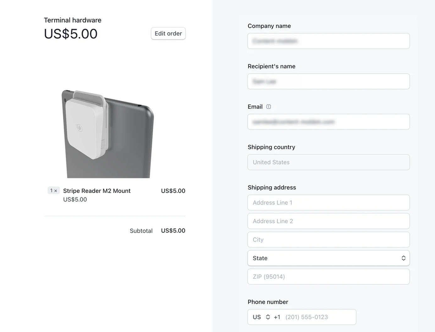
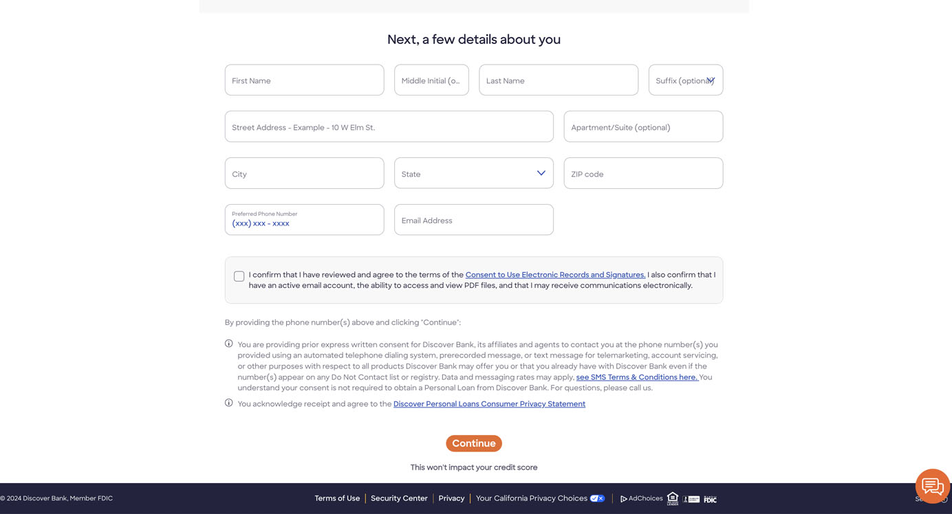
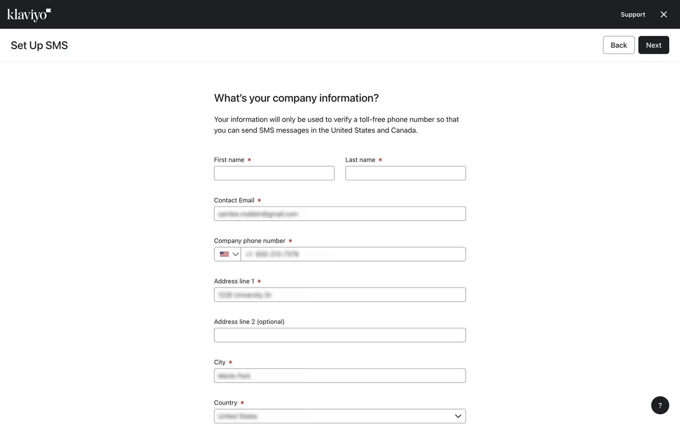
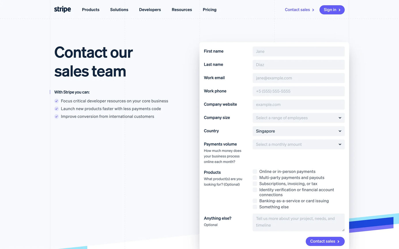
Use Single-Column Layout
Research consistently shows that single-column layouts outperform multicolumn designs for form-completion rates. A single column provides a clear, vertical path that’s easy to follow and scale across devices.
In contrast, multicolumn layouts require users to interpret the sequence and direction of fields; that interpretation can vary from person to person. This ambiguity increases the likelihood that users will overlook fields or misunderstand the expected flow, and the tab order may feel unpredictable to some keyboard users. The problem compounds for users with accessibility needs, as screen readers may process fields in an order different from the visual layout, and those using screen magnifiers might miss fields that fall outside their zoomed-in viewport.
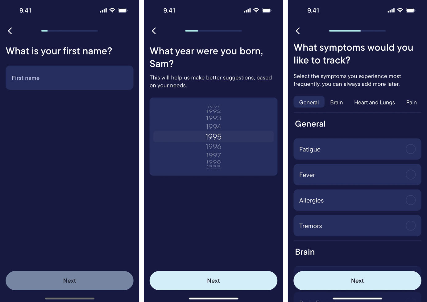
Utilize Progressive Disclosure
Long forms can overwhelm users before they even start. Progressive disclosure solves this problem by presenting only what’s needed at each step of the process.
When designing complex forms, show only what’s relevant to the current task, and introduce additional fields as users progress. This could mean breaking down a long complex form into multiple pages or implementing conditional logic that displays fields based on previous answers.
The “one thing per page” pattern, recommended by GOV.UK follows this principle by showing only one question or task per screen. This focused approach breaks down complex forms and makes errors easy to spot and fix, as users are dealing with one topic at a time.
Transparency
Uncertainty increases cognitive load — when users don’t know where they are or cannot predict what comes next, they must spend mental energy on speculation rather than completion. Transparency builds trust and puts users in control, making the form feel predictable and less stressful.
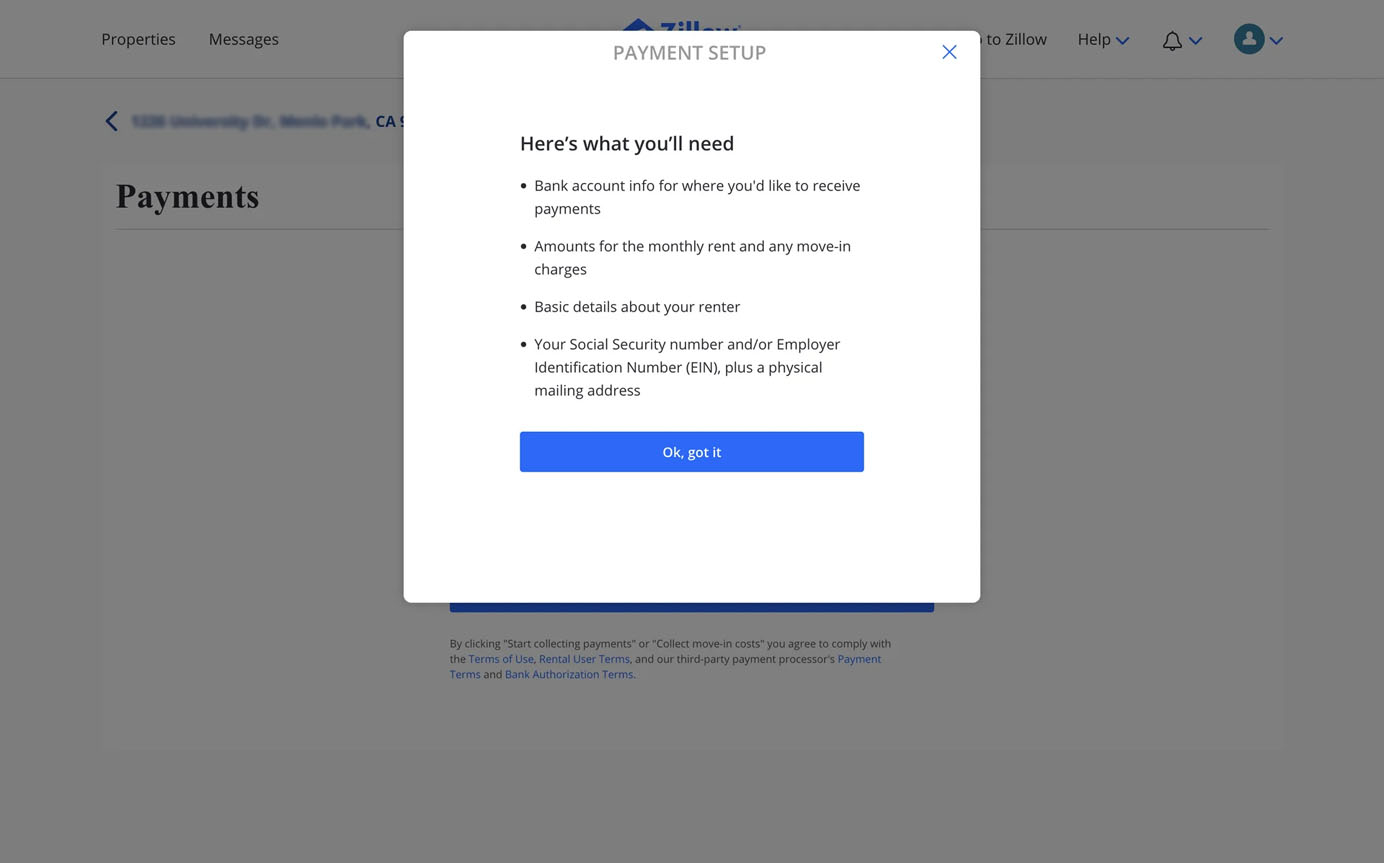
Communicate Form Requirements Before Users Begin
Users want to know what they’re getting into before investing time in a form. Clear expectations about required information and time commitment help users prepare mentally and decide whether to proceed. This is especially important for forms that take more than a few minutes to complete or those that don’t allow users to save their progress if they need to exit halfway.
When designing a long, multipage form, specify upfront:
- Estimated completion time
- Required materials or information (e.g., ID numbers, documents)
- Any deadlines or time limits
- Maximum number of attempts (if applicable)
- Whether progress is automatically saved or if users must complete the form in one session
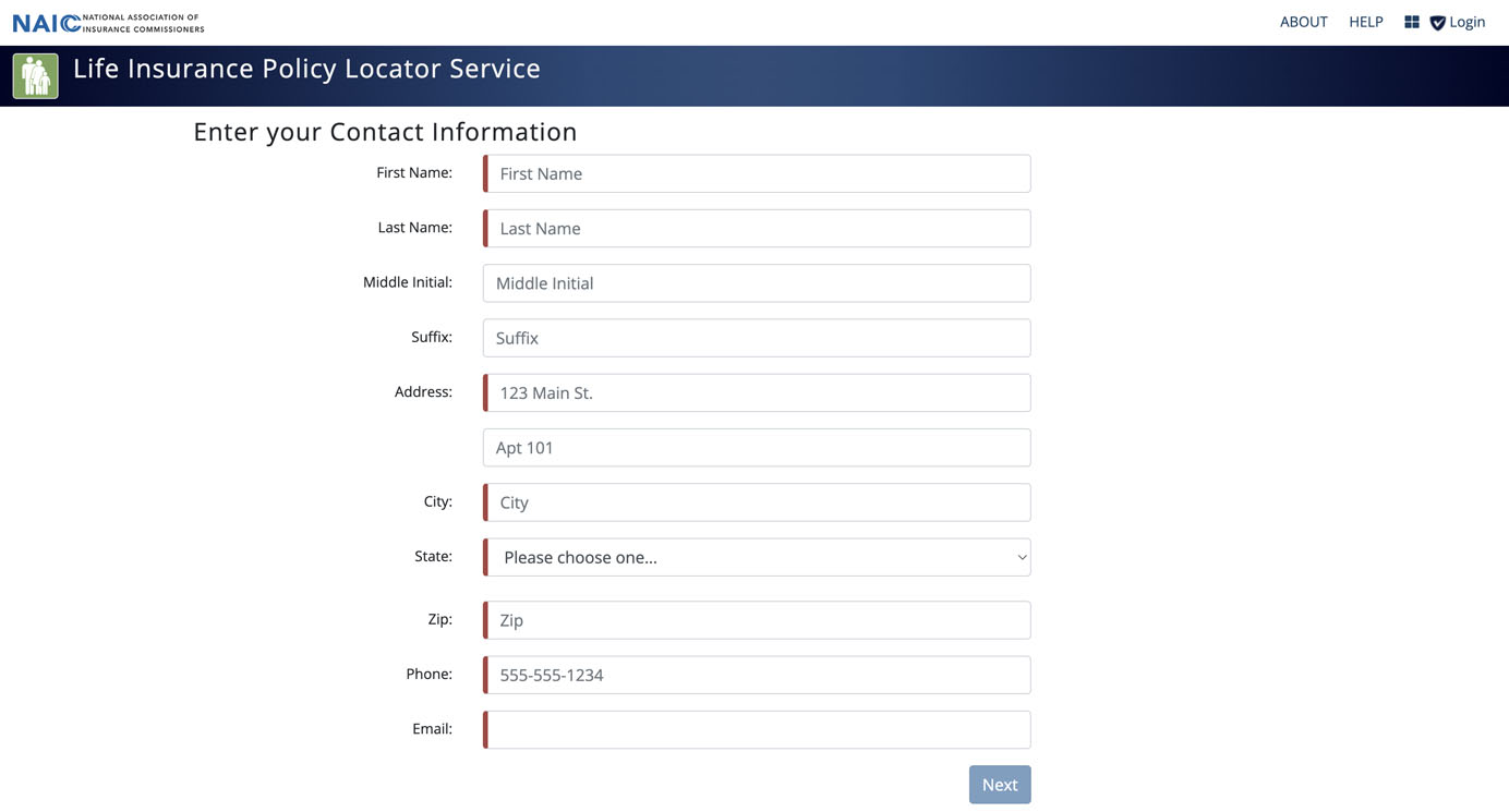
Mark Required Fields
Think twice before including optional questions, as each question increases the form length and the perceived effort to complete it.
If you decide to include optional questions, clearly distinguish them from required ones. In addition to using an asterisk to mark required fields, explicitly mark optional fields. This practice reassures users that they can skip nonessential questions and lightens their cognitive load. When marking is not clear enough, many people feel obligated to answer optional questions.
Show Clear Progress Indicators
As one of the 10 Usability Heuristics for User Interface Design, visibility of system status helps users understand where they are and decide what to do next.
In the context of completing a long form, progress indicators give users a visual representation of how much they’ve filled and how much remains, helping them gauge the effort required to complete the form. This sense of progression also fosters a feeling of accomplishment, which in turn motivates users to continue until the end.
In addition, making all the steps visible from the start serves as an overview of the process and helps users form a mental model of the form. This approach aligns with the structure principle discussed earlier.
Clarity
Ambiguity slows users down. Clear instructions and design ensure that users don’t waste precious mental resources deciphering what a question means or figuring out how to interact with the interface.
Use Plain Language
Form labels and instructions should be immediately understandable. Using plain language benefits all users, regardless of their background or expertise. On the other hand, technical jargon, internal company terminology, or overly complex language creates barriers that slow users. We usually recommend writing at the 6th to 8th-grade reading level for general audiences — users shouldn’t need to understand specialized vocabulary to fill your form.
The most effective forms use language that mirrors how users naturally think and speak about the information being requested.
For example, a healthcare form that asks for Chief complaint might confuse many patients, while Reason for visit communicates the same request in a more straightforward way. Similarly, asking patients to Indicate prior surgical procedures creates more cognitive work than simply asking Have you had any surgeries?
Before finalizing your form copy, test it with actual users and observe where they stumble. If you notice patterns of confusion or hesitation around certain terms, that’s your signal to simplify.
Use Positive Wording
Negative wording complicates how users interpret questions, as it forces them to mentally reverse statements. It increases cognitive effort and the risk of errors. This is especially relevant for standalone checkboxes — opt-in statements should use language that matches the intended outcome.
Avoid Double-Barreled Questions
Double-barreled questions are questions that ask about two things at once; they are a common survey pitfall. They introduce ambiguity as users might agree with one part but disagree with another.
For example, a survey question like Was our website helpful and easy to navigate? forces respondents to give a single answer to two distinct asks. Someone might find the content helpful but the navigation confusing or vice versa.
To eliminate the ambiguity, ask about one thing at a time: How helpful was our website content? followed by How easy was our website to navigate? This not only reduces cognitive load but also captures more-precise data that accurately represents user experiences.
Provide Context and Examples
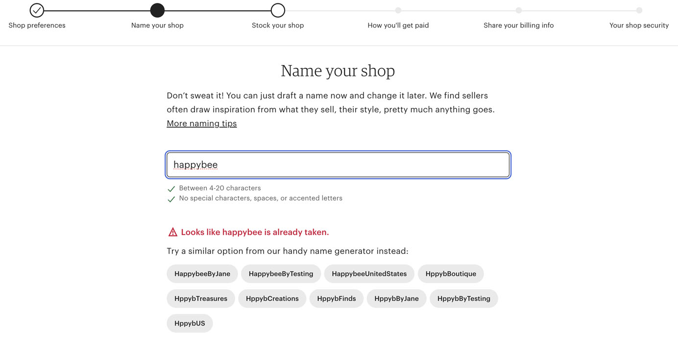
If a field requires a specific format or type of input, explicitly state the requirements upfront to prevent users from spending mental effort inferring what these may be or from guessing wrong. For example, date formats vary globally, so offering a simple formatting example — like MM/DD/YYYY or DD/MM/YYYY — gives users a concrete reference point and prevents errors that might otherwise require correction later.
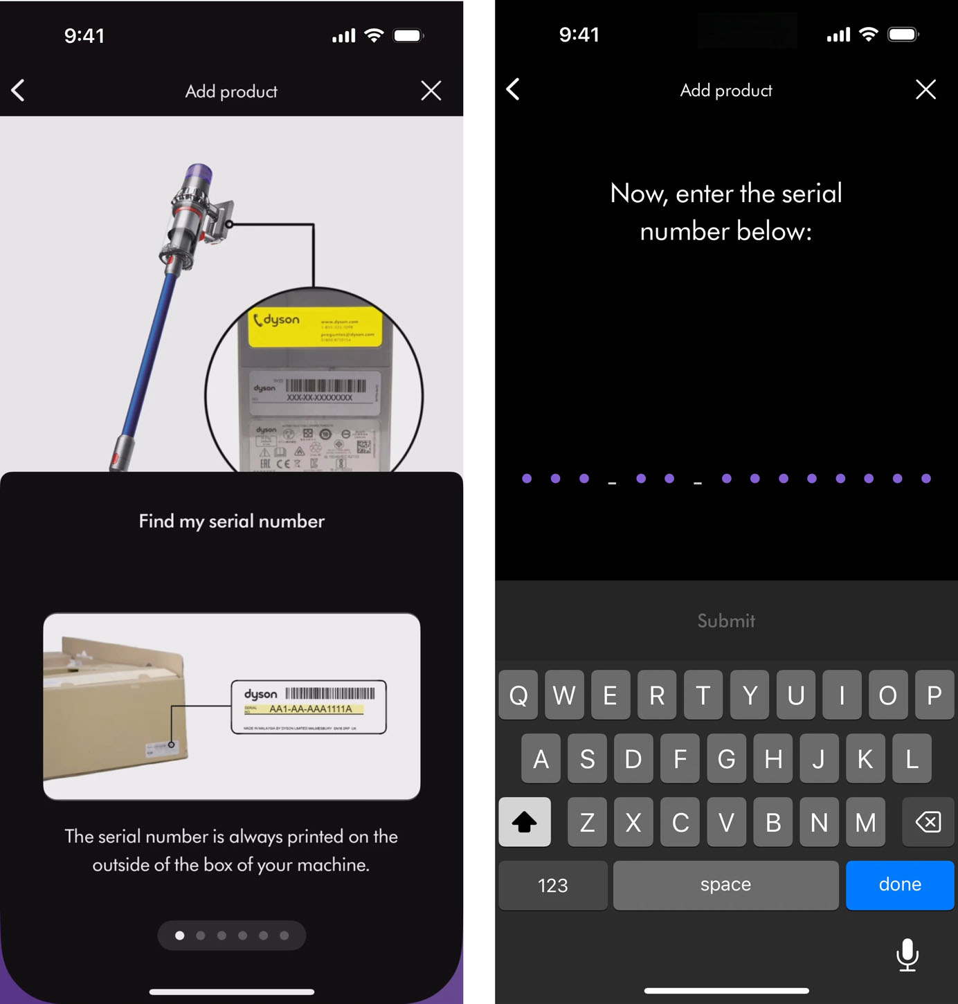
When requesting complex identification strings such as tracking numbers, product serial codes, or reference numbers, tell users exactly what to look for:16-digit code found on your receipt or 3 letters followed by 9 numbers (ABC123456789). This guidance eliminates the guesswork and helps users locate and enter the information accurately and efficiently.
Follow Conventions for Form Elements
Users develop mental models about how form elements should look and behave based on their experiences across websites. Using consistent, familiar patterns allows users to apply existing knowledge and focus on the task at hand, rather than figuring out how the interface works.
For example, consider how disorienting it would be to encounter a checkbox that, when clicked, automatically deselected all other checkboxes in the group (behavior normally associated with radio buttons).
Designers often feel pressure to create novel, distinctive interfaces that stand out from competitors. While innovation has its place, form elements are rarely the appropriate place for creative experimentation. The potential cost — confusion, errors, and abandonment — far outweighs the benefits of novelty.
Match Input-Field Length to Expected Content
The size of an input field provides a visual cue about the expected length of the answer.
A short field suggests a brief response, ideal for concise data like ZIP codes or age. A longer field implies that more detailed input is needed, such as an address, description, or comment. If the field length doesn’t match the expected input, users may question whether they understand what’s being asked.
Support
Filling out a form can feel like a mental marathon, and users should be supported at every step of the way. This means offering visible, persistent guidance, preventing mistakes before they happen, and providing timely assistance when errors occur. Consistent, thoughtful support builds user confidence and makes users more likely to stick with the form until the end.
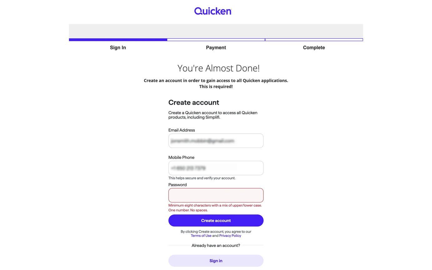
Avoid Using Placeholders
While placeholders — the text inside input fields that disappears when users tap into the field — may seem like a space-efficient way to provide guidance at first glance, they cause significant usability problems:
- They disappear when users start typing, forcing them to remember instructions using short-term memory.
- They typically use light gray text with low contrast and are thus difficult to read.
- They can be mistaken for prefilled values, causing users to overlook or accidentally skip fields.
Instead, keep both the label and help text outside the input field and leave the input field empty. This design ensures users have access to consistent, visible guidance at all times — whether they are actively filling out the field or reviewing their entry before submission.
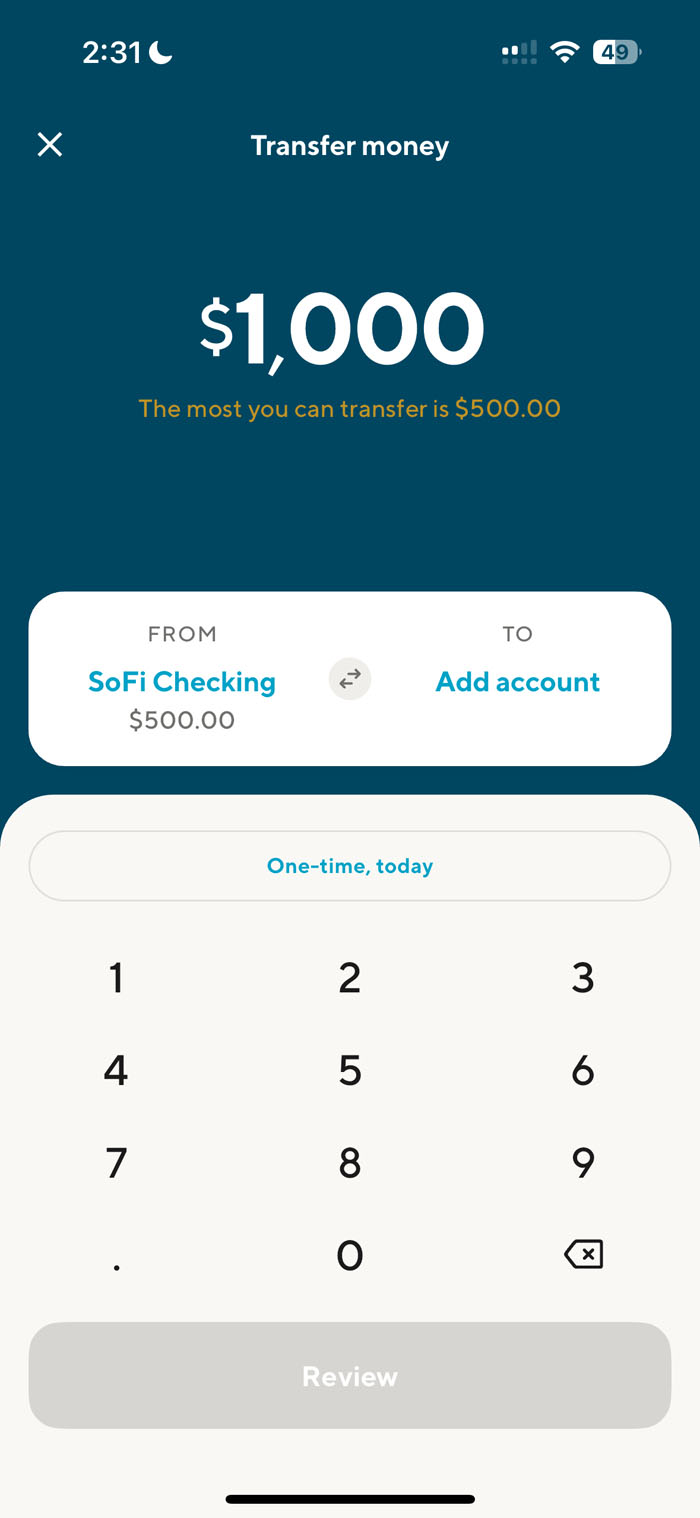
Include Helpful Constraints
While we should generally champion user freedom, in cases where clear rules define acceptable options, constraints become beneficial as they prevent users from making costly or time-consuming mistakes. Rather than letting users input invalid data and then showing an error message later, proactive constraints catch errors before they occur.
For example, when designing a banking transfer interface, preventing users from entering amounts exceeding their available balance is more effective than allowing them to proceed to trigger an invalid transaction or overdraft.
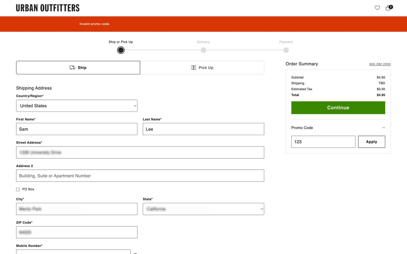
Display Timely, Visible Error Messages
Users are only human, and mistakes happen. The key is offering support at the right moment without disrupting users’ flow. The ideal approach should achieve a balance between giving users space to work and catching errors early.
- Avoid premature validation: Don’t display errors as soon as users click into a field or just start to type — they haven’t even had a chance to type anything yet. Premature validation is often considered a hostile pattern as it disrupts users’ flow with unwarranted scolding. As a rule of thumb, avoid displaying the error until the user has finished with the field and moved to the next field.
- Use real-time validation selectively: Implement real-time validation only when users benefit from immediate feedback (such as a password-requirement checklist) or when the error message helps prevent critical mistakes. Otherwise, it may distract users from their primary task.
To minimize cognitive load, error messages should be displayed next to the field containing the error. If the error message is displayed in a dialog or far away from that field, the user will need to commit the message to memory in order to fix the error. This increases cognitive load.
Additionally, error messages should provide constructive communication, and respect user effort. Rather than just pointing out problems, they should guide users toward fixing the issue, highlighting the specific mistake and offering practical suggestions. Thoughtfully designed error messages help users feel supported rather than blamed.
Conclusion
Filling out a form is like scaling a mountain — users need a well-marked path (structure) to guide their steps, a clear view of what lies ahead (transparency) to stay oriented, easy-to-understand signposts (clarity) to navigate confidently, and robust guardrails (support) to keep them from stumbling. By applying these four principles — structure, transparency, clarity, and support — you’ll design forms that allow users to spend less time figuring out what to do and more time providing valuable information.