
How user behaviours shape product design architecture, and how AI will reshape the digital products landscape.
Architecture in digital product design is controversial and ambiguous. On one hand, there is Information Architecture; on the other, there is System Design. Career ladders and design positions often require one or the other. They are considered important, but people seem to mean different things when talking about them. Normally, people mean something related to how information is organised and accessed. Like sitemaps, navigation, content taxonomies, user flows, data indexing, etc.
Neither Information Architecture nor System Design appears to clearly translate into established product design work, processes, artifacts, or mental models [1, 2, 3]. A few years ago, I consulted a company that was doing one of the first AI recommendation engines on the market, and the team was particularly concerned about making “Information Architecture” right in their Back Office. Rightly so, but it turned out that what they really meant was how product sections are grouped and presented in the navigation. The team did research and was happy to update it. Was that work important? Yes. Is it architectural work for a product? Sort of. If we consider the architecture of informational products as a way of how access to information is organised, navigation is just a small fraction of that work. Navigation may be significantly less relevant for other products like TikTok, Airbnb, Shazam, or Headspace, but they still architecture access to information, right?
I think where people generally agree is that giving informational products the right structure and giving users the right tools to get to information is one of the most important jobs for product and design teams. It defines the mental model of how users understand a product and has a disproportionate effect on how effectively users can do what they need to do. The quality of architecture translates into outcomes for a full range of product performance indicators. But I don’t think that there is clear framework about how products are organised. It makes it unnecessarily harder to work on and discuss with a team and stakeholders.
I’m going to suggest a way to think about Product Design Architecture and how User Behaviours shape it with Mechanisms to access information. I will describe just one of the behaviours, look at a few products’ architecture examples, and show how the model helps to understand products and spot opportunities. Understanding why and how products are organised in certain ways will help see how and if AI can reshape the current digital products landscape.
Product design architecture and user behaviours
Different products help users achieve different goals. Normally, one product has features that address different needs and use cases. Products’ interfaces reflect that. The way how products organise, give access to, and present information makes their Product Design Architecture. It’s quite different for a booking system, social network, personal website, or productivity tool.
On Airbnb’s website, for example, the first thing people see is a prominent block of filters and groups of recommended homes. It lets users extract a suitable place to stay based on certain criteria. On Instagram, there are no filters, but an endless, uniform list of photos. Users scroll through stories or posts to explore if anything interesting happens in their friends’ lives. On the website of the design studio Verve, there are the company’s brand statement and case studies. Users try to understand what the company does and if it would be good for their task.
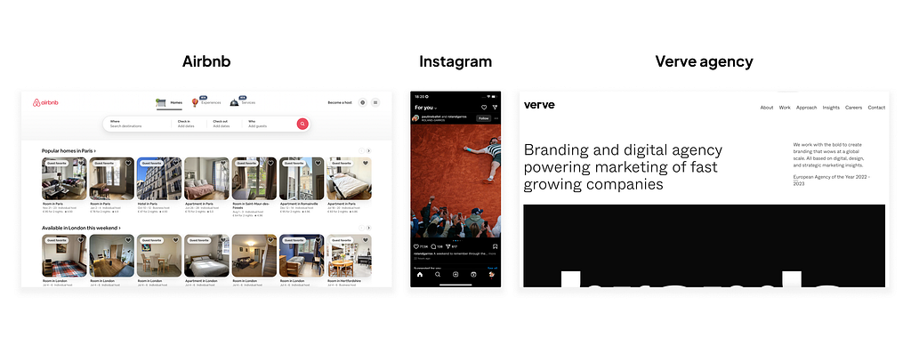
If we boil it down to primitives, products are just interface layers between users and databases. Airbnb is just a database of accommodations, Instagram — of photos and videos, Verve Studio website — of statements and articles. They wrap information into a shape of UI that lets users get to relevant information in a suitable way.
There are an endless number of goals and situations in which users utilize products. Those products have very different interfaces that let users achieve their goals. Generally, the choice of an interface depends on the behaviours users have when getting to information.
I looked into a hundred products and read a dozen research papers about information-seeking behaviours and found eight core User Behaviours in informational products:
- Search. When a user needs to get an exact particular item or a piece of information and not any other one. Think of Finder or Confluence.
- Control. When users need an overview of a system. Think of Flo or Posthog dashboard.
- Return. When users have already seen information and need to get back to it. Think of Shazam or Safari history.
- Understanding. When a user needs to absorb relevant information about an entity and draw a certain conclusion. Think of any studio or personal website.
- Match Extraction. When a user has just attributes in mind and needs to get something that would satisfy those attributes. Think of Airbnb or KLM Airlines’ website.
- Pass Process. When a user passes a process and needs to get the next item. Think of Duolingo or Udemy courses.
- Exploration. When users just look around and are open to engaging with anything that looks interesting. Think of Pinterest or YouTube.
- Getting Something Relevant. When users need something, but have no major preference about the exact item. Think of Headspace.
User Behaviours define and shape what a product interface has to be like. Airbnb, KLM, and Zalando sell very different things but look similar in a lot of ways. Users get to products that match certain requirements, overview options, and make a choice out of available options. They are primarily made for the same Match Extraction behaviour to let users find a suitable option. Airbnb, Instagram, and Verve are obviously very different because users have different behaviours and products have to have different interfaces. If you like, you can pause for a minute and take a look at how other products, such as Pinterest, Notion, Shazam, Flo, Wolff Olins' website, Duolingo, and Headspace, let users access information.
Interface mechanisms and examples
Every User Behaviour has a set of Interface Mechanisms that naturally support it. If a user is looking for a hotel we let them filter by location and dates, and then refine results with price range and location preferences. Someone who is trying to kill ten minutes would just scroll through content hoping to see anything entertaining enough. Filtering, search, navigation, list of previously seen items, charts, listings, descriptions, and process steps are all interface mechanisms that organise and let users get information in a specific way. They are that intermediate layer that lets people access relevant information from a vast number of options in the database on the other end.
Getting back to Airbnb, Instagram, and Verve examples. What if Instagram would let users find information the way Airbnb does, Verve like Instagram, and Airbnb like Verve? Would the same users be able to get what they normally do in those products? Why so?
Match Extraction behaviour.
I’m going to look at only one Match Extraction user behaviour as an example. Users have it when they have certain criteria and need to get to an item that fits well. For example, when they are trying to find accommodation, a flight, a good Data Science course, or a chair for a living room.
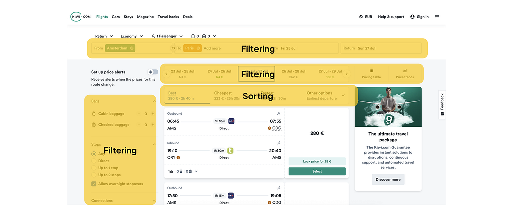
In the case of Match Extraction, users need to narrow down the scope by certain criteria, look into results, and eventually choose one option. In most cases, they will see a few options that have advantages and disadvantages from different sides. Users should be able to refine the criteria and learn about available options from different perspectives. Products should support users in making a final choice. Filtering and Comparison are two mechanisms that support Match Extraction behaviour and there are a few more.
Common mechanisms that support Match Extraction behaviour are:
- Filtering
- Listing refinement
- Expanded Org Structure
- Listing
- Comparison
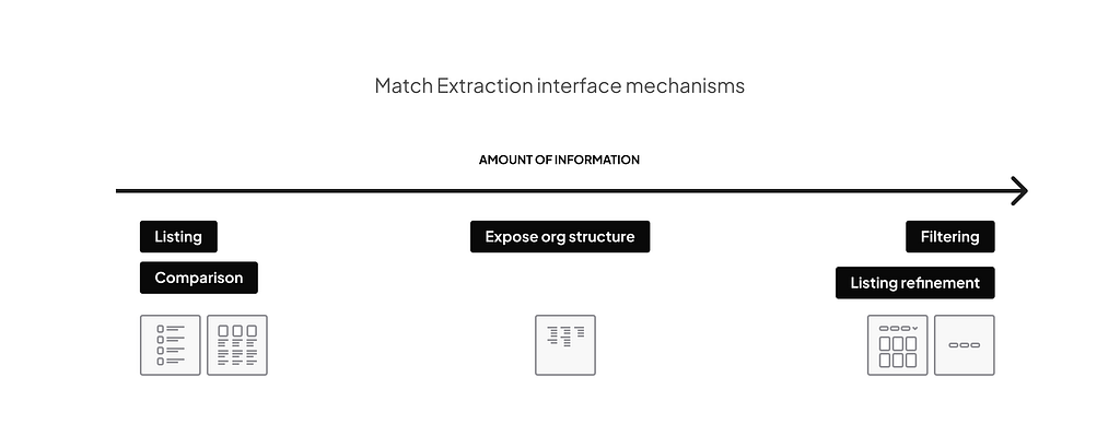
- Filtering
No surprise that filtering is the most basic mechanism here. It is a natural way to narrow down the scope of information. Based on how relevant the criteria are, filters may have different looks and placement. They can be exposed as the first thing users see on the page. Or they can be collapsed into a filtering menu, which can only be accessed if needed.
2. Listing refinement (filtering and sorting)
Users refine what they see with filtering and sorting. Filtering helps to narrow the scope down to the point when it’s easier to look through than to filter further. Sorting helps to surface more relevant options.
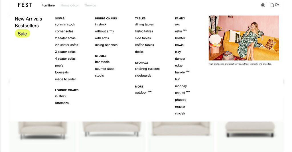
3. Expanded Organisation Structure
When getting to a certain category is important, there are not that many of them, it can be better to have a whole organisation structure exposed instead of filters. Menus let users see multiple levels of information hierarchy and drill down right into the most relevant category. Essentially, it is the same filtering, but users see the whole ‘menu’ at once. This way users can also get familiar with what is available.
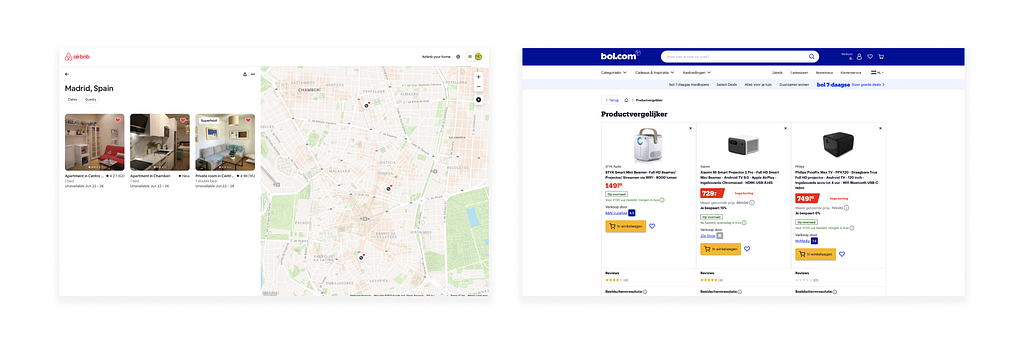
4. Comparison
Users filter, look through, and find a few options that are good enough but have different advantages. Comparison helps them look at the items side by side and make a choice.
Behaviour and mechanisms shape how products are organised and it works the same way on lower functionality levels. A client might be looking for a creative studio to make product identity and packaging. Generally, studios’ and personal websites are built around behaviour to let visitors Understand. But locally, on pages like “Past works” Match Extraction would be a primary behaviour. You can see how Pentagram, Dumbar, and Verve have it.
Match Extraction is one of the most widespread behaviours. Most booking systems and e-commerce stores have it defining their Product Design Architecture. From Booking.com to personal websites. Products have to give users enough flexibility to be able to find information matching their criteria, control to be able to look at available options from different perspectives and support them in making a decision. When done well, it gives users a sense of being able to find what they need and make a choice comfortably.
User behaviours in real products
In practice, almost all products have a mixture of different behaviours they have to support. I’m going to give examples of two: Airbnb and Shazam.
AirBNB
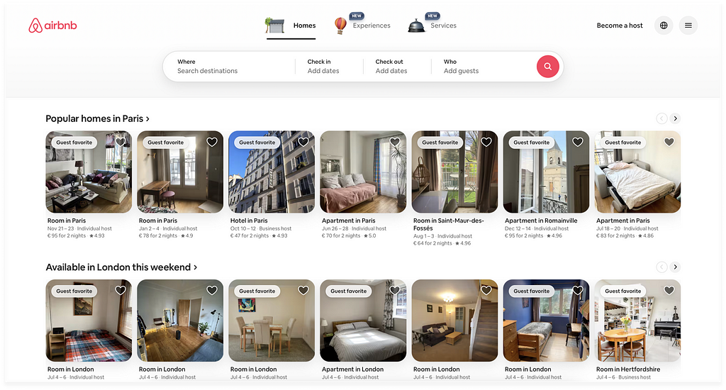
At the main product level, Airbnb clearly prioritises value that requires two behaviours: Match Extraction and Exploration. Users who are looking for a Tenerife weekend stay would use the main filtering to kick it off.For others, who are open to exploring, they expose lists of recommended or feature homes.
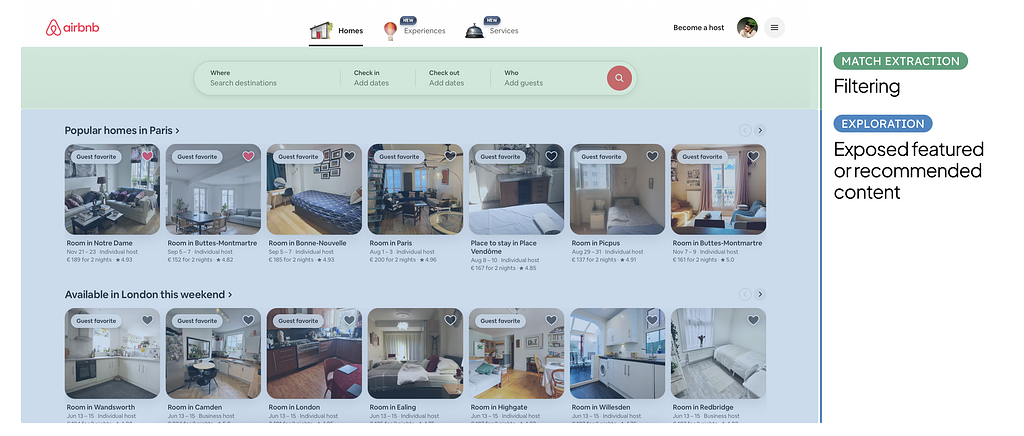
Knowing what behaviours Airbnb serves, it’s easier to understand changes in the homepage structure and see opportunities. Airbnb is a multi-product company. It makes it more complicated, but also more interesting to see how the company that stands for high experience quality handles it. They went through quite interesting evolution in the last 10 years and I like differences in versions of 2016, 2022 and 2025.
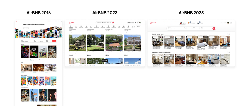
Throughout all versions, they similarly prioritise Match Extraction and always have the main filtering at the very top. Right below go features for Exploration. Architecturally, the main difference for all years is in what Airbnb offers to explore and how they show it. With one catch that I will get to in a bit.
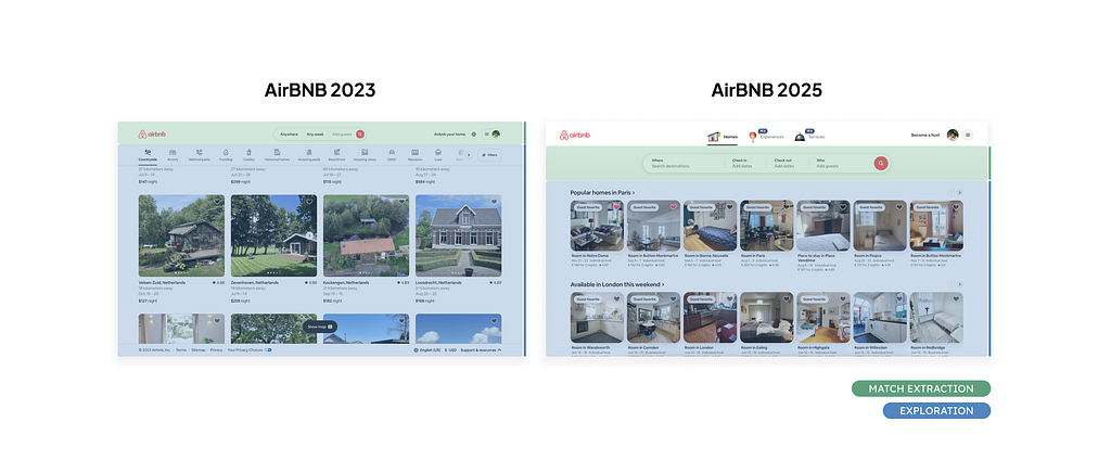
The 2023 and 2025 pages look very similar despite different content. In 2023 Airbnb introduced Airbnb Categories, like National Park, Castle, or Beachfront places. They are basically featured categories but, to explore, Airbnb made users switch between them at the top. The listing was left as a basic, uniform grid of homes. In 2025 they changed what they put forward and the layout became more conventional rows of recommended homes categories, like “Popular homes in Paris” or “Available in London this weekend”.
In 2025, Airbnb introduced a new Services product. I’m not sure how intentional was that, but they took a very different approach to letting users explore new value compared to 2016 when they released Experiences.
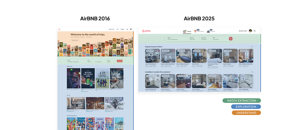
In 2016 Airbnb created entry point sections right on the home page to get a sense of Experiences and Homes. A bit simplistic in some places, but it gave an overview. In 2025, the homepage change is limited to different flavours of Featured and Recommended categories and stays 100% Homes. It makes it look like Services is a careful experiment and not a new product proves worse, taking users’ attention from the main business yet.
Another thing that stands out is that in 2016 they had a huge brand statement section at the very top. Meaning at the time they were trying to help visitors Understand what Airbnb is.
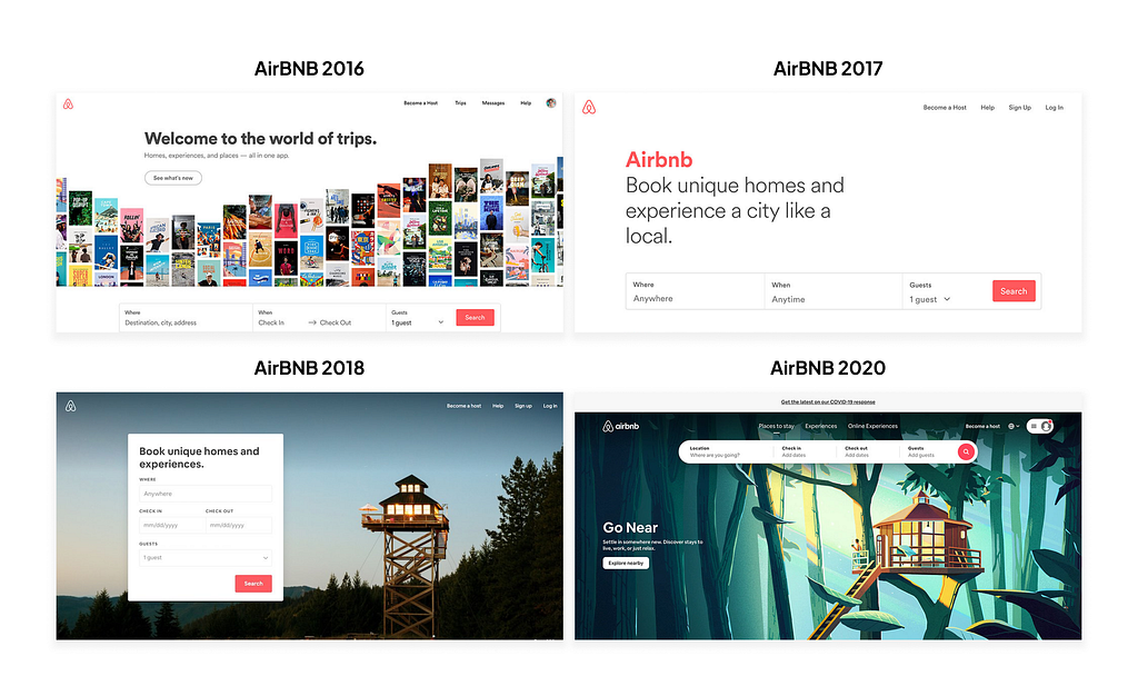
The message became quite different in 2017, got much smaller in 2018, and by the middle of 2020, the title was completely gone. I guess it is because of the combination of two factors. On one hand, they probably decided that they didn’t need to cover that behaviour anymore; on another, they tried to rebrand towards a “world of trips” company, which didn’t seem to work out.
Looking at architecture through behaviours, it’s easy to spot that Airbnb might be missing a natural opportunity. Their product is built around end-to-end Match Extraction behaviour. In this case, mechanisms that would support making a choice, like favourites, should be part of a ‘dashboard’.
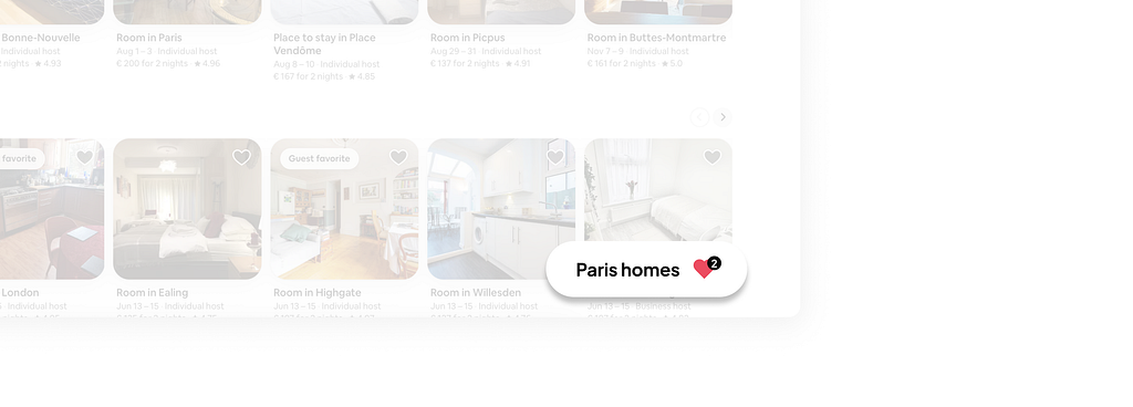
Now users can find homes, but the final step of making a choice is more complex than it should be.
Shazam
Shazam is a product that recognises music. When users hear a nice tune and want to know who is playing, they turn on Shazam, and it finds an artist and a track. It has to let users Search for a song and then Return to it. These behaviours naturally define its architecture. To increase engagement Shazam also tries to get users to Explore similar artists and songs.
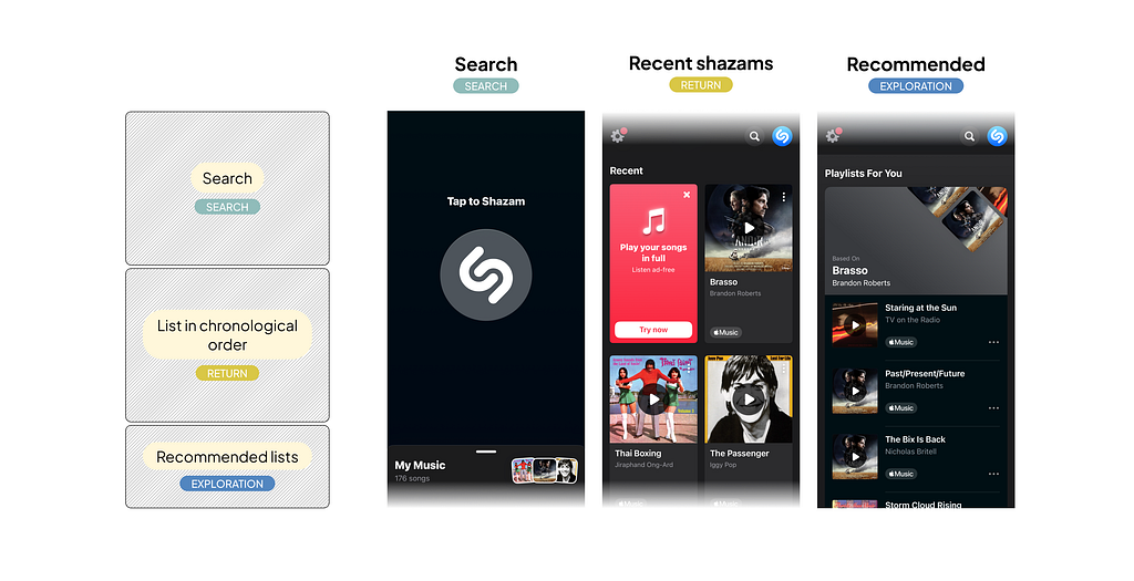
Shazam’s architecture is simple and focused. The search button takes up the whole first screen. It is a bit different from what we used to see as a search because it takes sound as an input instead of text. Down below are lists of previously‘shazamed’ songs and recommended playlists. List in chronological order is the most basic mechanism that supports Return behaviour. Recommended content is a very basic Exploration mechanism. It creates a chance to engage a user in a new flow of consuming more.
It wasn’t always straightforward like that though. It’s interesting to compare today’s Apple’s Shazam with a version of around 10 years ago.
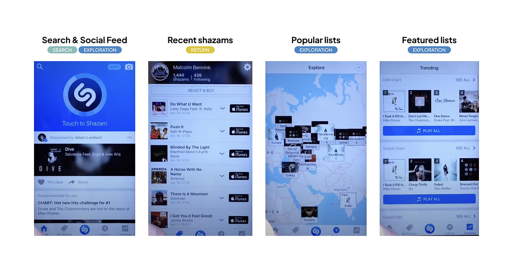
These two architectures are quite different because they support different business goals. The current architecture is simple and optimises the user journey for conversion into Apple Music. Apple bought it in 2020 as a natural acquisition channel. Plus it is an amazing source of data about users’ preferences.
‘Old’ architecture is way more complex. Shazam tried to build up more value to be sufficient as an independent product. Three out of four product sections, including the home page, were built around Exploration behaviour. With social feed, popular lists, and countries charts.
I think that Shazam’s current design architecture is a good example of a product that knows where to stop. It lets the product focus and deliver value that clearly matches the product promise. It doesn’t make sense to support other behaviours. Users don’t need to Extract a Match, Pass a Process, or Control anything here. Core Return behaviour also has other mechanisms, like favourites lists, that would only make things unnecessarily complex. Simplicity is often harder than complexity. The choice of the scope of the mechanisms might be as important as the choice of the right ones. If you are curious, there is a case study about Shazam’s re-architecture by one of the designers.
Most products optimise their architecture for certain primary behaviours and implement mechanisms for a number of supplementary ones. The most important and often the most interesting is how behaviours are prioritised and in what ways products combine interface mechanisms. What is getting exposed and polished and what stays hidden or underdeveloped?
A lot of the ideas about User Behaviours and Information Access Mechanisms are founded on the experience of informational products as we have known them for the last 30 years. Satya Nadella famously told on the BG2 podcast that“business applications will collapse in the agent era”. Does it make the conversation about Product Design Architecture irrelevant? How will Interface Mechanisms change and what opportunities will become available with greater adoption of AI?
Impact of AI
A few years in, AI still makes baby steps compared to the magnitude of changes a lot of people predict. Will AI completely reshape how we are getting access to information? What UI mechanisms and User Behaviours will disappear, evolve, or stay as they are? Will some products become irrelevant or have to be transformed? What opportunities are there to redesign existing products?
Before talking about AI, a few remarks about it and user interaction in general:
- By AI, I mean current LLMs that generate predictions based on large data samples and context input. I don’t think it is reasonable to look any further than the current stage of AI development.
- Selection is generally easier than other active interactions like typing or speaking. For now, the main interface to interact with LLMs is conversational input.
- Visual is the most convenient way of consuming significant amounts of information. It doesn’t make sense to talk about audio or some kind of neural link as a major mechanism of human-computer interaction at this point.
- UI Mechanisms can evolve, but User Behaviours stay the same, as long as users are humans.
A bit about how LLMs work. They take vague input and context in and generate the most likely output based on patterns of a huge pool of information it was trained on. Input, context, and pool of information are variables. Users can ask for “acafé with a sea view in Lisbon”, “Jack’s yesterday presented ”, or “why MAU dropped” and get a solid answer.
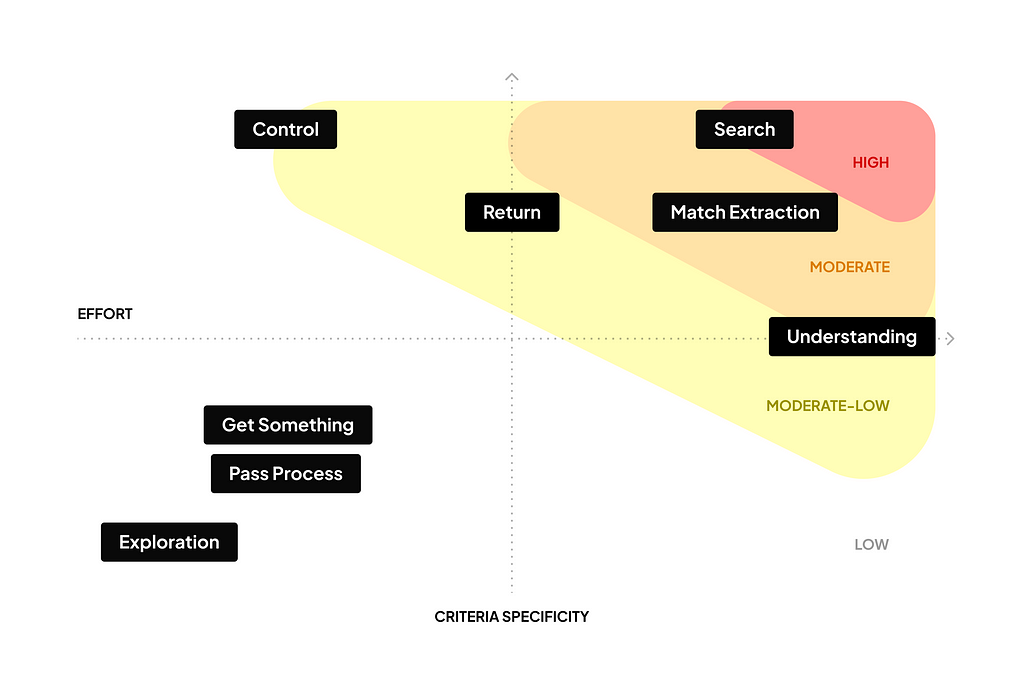
On the product side, there are two important characteristics of User Behaviours and existing UI Mechanisms: how specific are the criteria that users have for information and the amount of effort users have to make to get to it. If a user is Searching for the last feature design in Figma, the criteria are very specific, and the user will have to search, look through the results, and probably a few files. If you have ever tried to do this in a design space of 50 people, you have a good idea that it might be quite tricky. Specific criteria, big effort. Another user may be scrolling through TikTok and have no clue that a funny duck video they will see in a minute is exactly what they need. Vague criteria, little effort.
The more specific criteria users have and the more work they have to do to get to information, the more likely AI can improve UI mechanisms.
The biggest change, and we are already experiencing it, will likely happen to mechanisms of Search behaviour. AI is brilliant when it comes to taking vague requests and instantly shaping the most probable answer within conditions. That’sbasically the definition of LLMs. The process of putting in the right request, looking through the noise of search results, or documents’ content is gone. Further than that, LLMs also ‘understand’ information that wasn’t available before. Now users can just ask for “hiking photos with Alex” or “sales calls moments where clients complained about billing”.
AI has a realistic ability to transform not only local in-product search mechanisms but also impact entire products, that were built around Search behaviour. Search engines Searched the Internet, and other similar services did the same within individual products.
For other behaviours and interface mechanisms, the impact will likely be smaller. For Match Extraction, for example, mechanisms can be improved by taking freeform input to filter or refine listing. Control behaviour has mechanisms that make information neatly organised, like dashboards and charts, but AI can help users drill down and look into details. On the other side, the impact on behaviours with vague criteria and already low effort, like Exploration, would likely not be significant. Friends, TikTok is safe.
I think that it is unlikely that AI will transform products, that mainly provide access to information, into something unrecognisable. That doesn’t apply to creation tools and back-end mechanisms. For creation tools magnitude of change is very big, up to transforming products and people’s roles. It is very different from what this text is about, though. Recommendation engines get to ‘know’ users better. Not visible to users, but improvements are also already happening on the back-end side that decides what content to show to users.
AI is exciting and disruptive, and it moves fast. It introduces a lot of product opportunities and makes things feel more human and natural. It creates a shift at the mental model level of how tasks are being done. Adoption of this level of change usually takes the most time. People are used to doing things in a certain way and expect to interact with products through familiar mechanisms. It will take some time to understand and explore all opportunities, and it’s fascinating that some of them are so natural that they are already being adopted.
Conclusion
Product Design Architecture is an essential part of designing a product as a coherent system that delivers the intended value. It is like developers’ system architecture that product and design people don’t seem to have. The ability to understand and design coherent architecture is essential for product teams and a core skill for designers to progress to and beyond the Senior level.
User Behaviours and Interface Mechanisms are foundational for designers and product teams as a mindset, as a mental model, as a tool, and as a common language. They help to see things from a higher level perspective, establish healthy architecture, and convert strategy into well-functioning products. Having tools for describing users from a Behaviours perspective and products at the architecture level enables teams to be intentional.
In my own experience, this perspective helps to significantly boost speed, quality, ability to explain, and confidence in solutions. It’s much easier to start with typical mechanisms, balance architecture that covers different behaviours, see the impact of changes, and be sure that nothing essential is missed.
Interface Mechanisms may seem like narrow-minded limitations or as an opportunity. In no way do they mean to be prescriptive of what products should be and how they are supposed to work. Any team should understand how their product’s architecture works, experiment and validate solutions. I hope that the idea and general principles of Product Design Architecture, User Behaviours, and Interface Mechanisms, can help this work to be easier, more thoughtful and intentional.
***
A lot is left out. There are many more things to Product Design Architecture, like how user jobs convert into product architecture, other behaviours, interface mechanisms, more real product architecture examples, and transformation happening with AI.
📕 If you are curious to learn about it, sign up to be notified when the book about Product Design Architecture comes out.
***
Huge thanks to Gena Drahun, Swarna Krishnaswamy, Stanislav Govorukhin, Kamil Krupski, Jon Atwell, Valentin Sauts, Vlad Ponomarenko, Taras Brizitsky, and Andy Budd for honest feedback, and getting through messy first drafts.
User behaviours, product design architecture, and the impact of AI was originally published in UX Collective on Medium, where people are continuing the conversation by highlighting and responding to this story.